
How to Design a Thumbnail People Actually Click
A thumbnail has one job: stop the scroll. Here's how to design one that actually gets clicked, including the sizing mistake almost everyone makes.
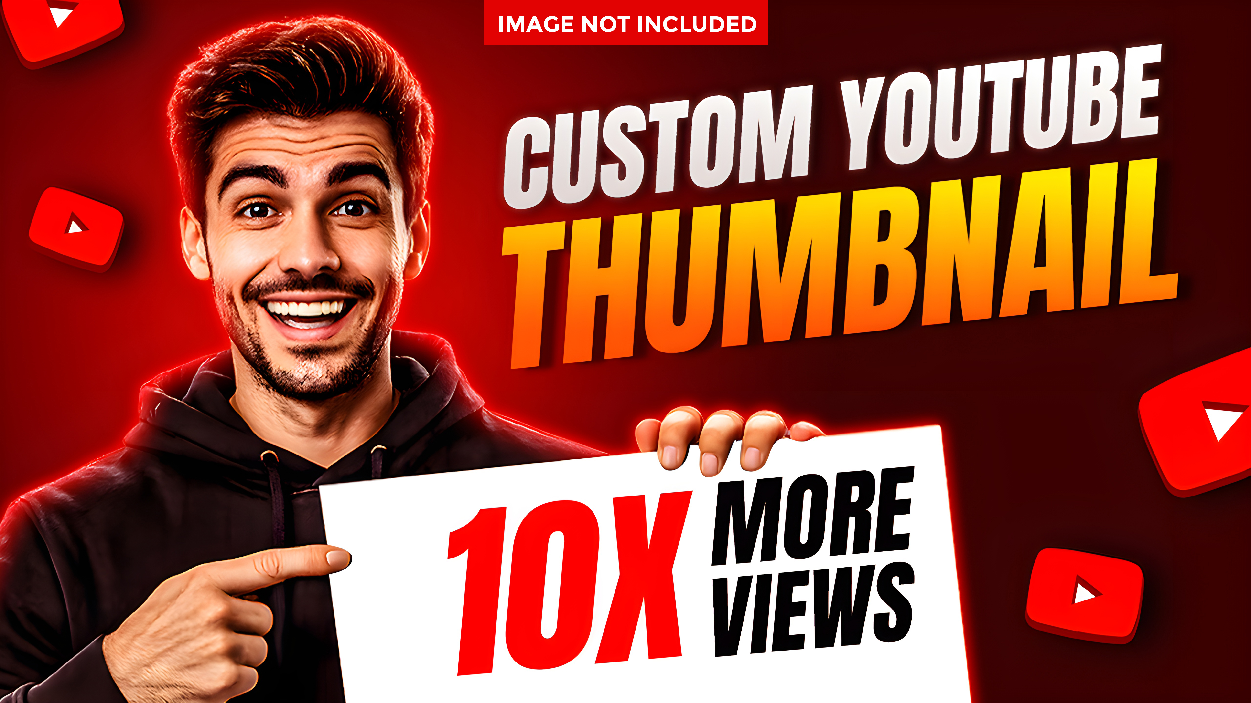
Nobody sees your thumbnail at full screen the way you designed it. They see it tiny, next to a dozen competing thumbnails, for about half a second. Its only job is winning that half-second. Everything below is built around that one fact.
Step 1: Design for tiny size first
Before finishing anything in Canva or your editor, zoom out or shrink the preview down to roughly the size it'll actually appear at on someone's phone. Text and details that look great full-screen often disappear completely at real thumbnail size. Catch that now, not after publishing.
Step 2: Pick one clear focal point
A thumbnail with five competing elements loses to one with a single clear focus. A face with an obvious expression, or one bold word. If someone can't tell what the thumbnail is about in half a second, it's already lost.
Step 3: Use high contrast
Light text on a dark background, or dark text on a light background. Never text sitting directly on a busy, similarly-toned photo where it blends in. Contrast is what makes something readable at a glance, which is the only glance you're going to get.
Step 4: Keep text to 3-5 words max
A thumbnail isn't a caption. A full sentence is unreadable at small size and defeats the point. Pick the 3-5 words that carry the actual hook, and cut everything else.
Step 5: Test more than one version
Where the platform allows it, put together two or three versions and compare, whether that's a formal A/B test or just posting one to your story with a quick poll for feedback. What looks best to you in the editor isn't always what actually gets clicked.
Step 6: Make sure the thumbnail keeps its promise
Whatever the thumbnail implies the content delivers, the content needs to actually deliver it. A thumbnail that oversells and underdelivers might win the click once, but it costs you saves, shares, and trust on every video after that.
Common mistakes
- Cramming in too much text or too many design elements competing for attention.
- Low contrast that makes text unreadable once shrunk to real size.
- A thumbnail that promises something the content doesn't actually deliver.
- Never testing more than one version before publishing.
- Ignoring the platform's actual aspect ratio, so the thumbnail gets awkwardly cropped.
Your first step
- Design your next thumbnail, then shrink it down to check it's still readable at real size.
- Cut it down to one clear focal point and 3-5 words of text.
- Check the contrast between your text and background.
- Put together a second version to compare against the first.
- Confirm the thumbnail's promise actually matches what the content delivers.